PRO ALLIANCE
Logitech G
branding
branding
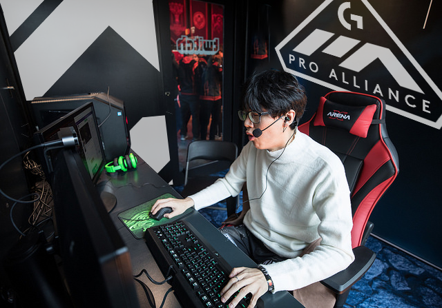
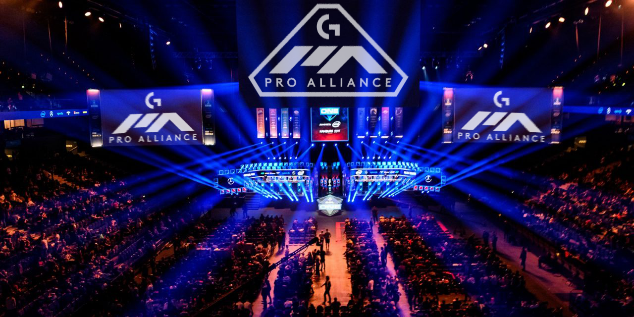
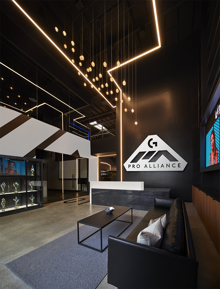
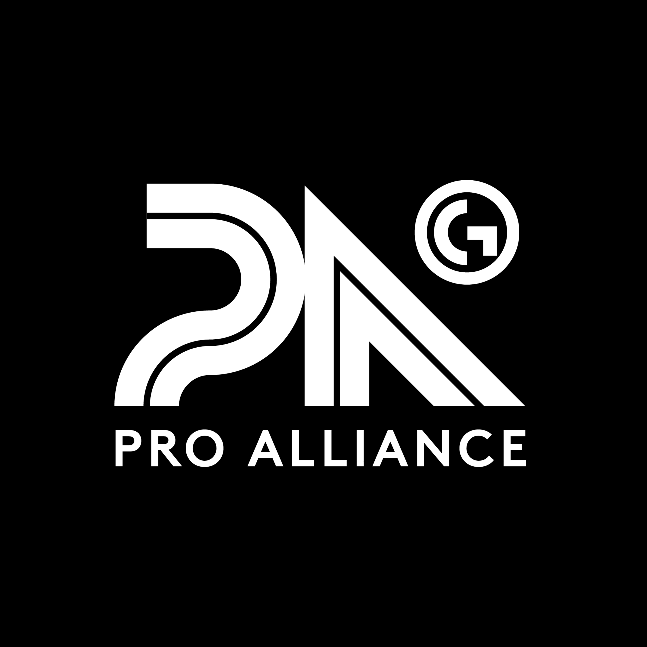
When Logitech G was concepting the Pro Alliance, they needed a logo and series of icons to represent their five pillars. The vision of the organization being a community resource, lead by experts, dedicated to the development of pro-gamers in these key areas; Equipment, Health, Psychology, Skill, Teamwork.
They wanted a mark that fit with their existing brand (clean/geometric/scientific), but felt exclusive, fashionable, and high performance. An identity closer to an athletic brand, that would still fit into the aesthetic of an e-sports event.
︎︎︎ Geometric
︎︎︎ High performance
︎︎︎ Exclusivity
︎︎︎ Fashion


iconography︎︎︎


I developed and presented around 10 marks, which is about 5 times more I typically would for a branding presentation. They quickly narrowed their choice for further development.
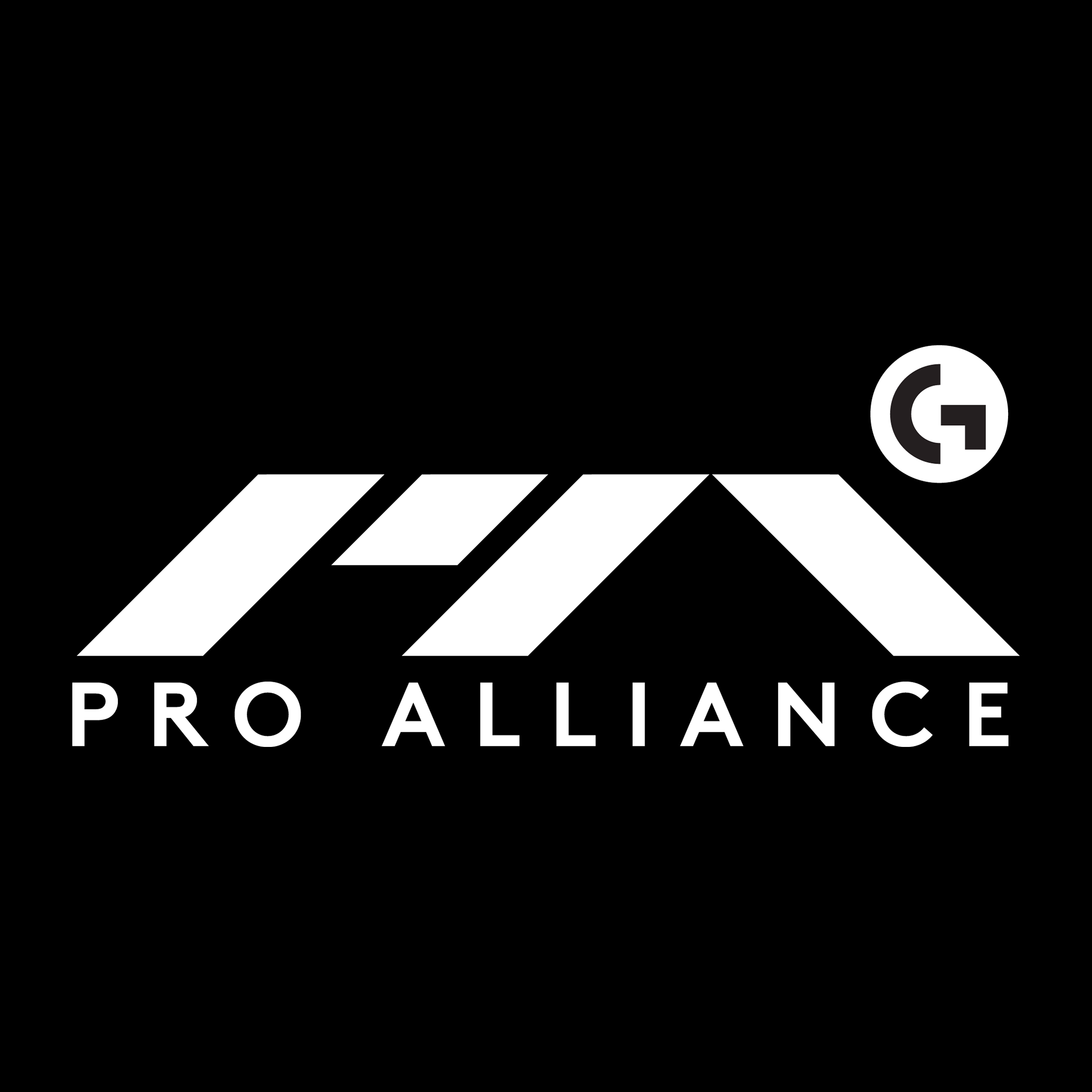
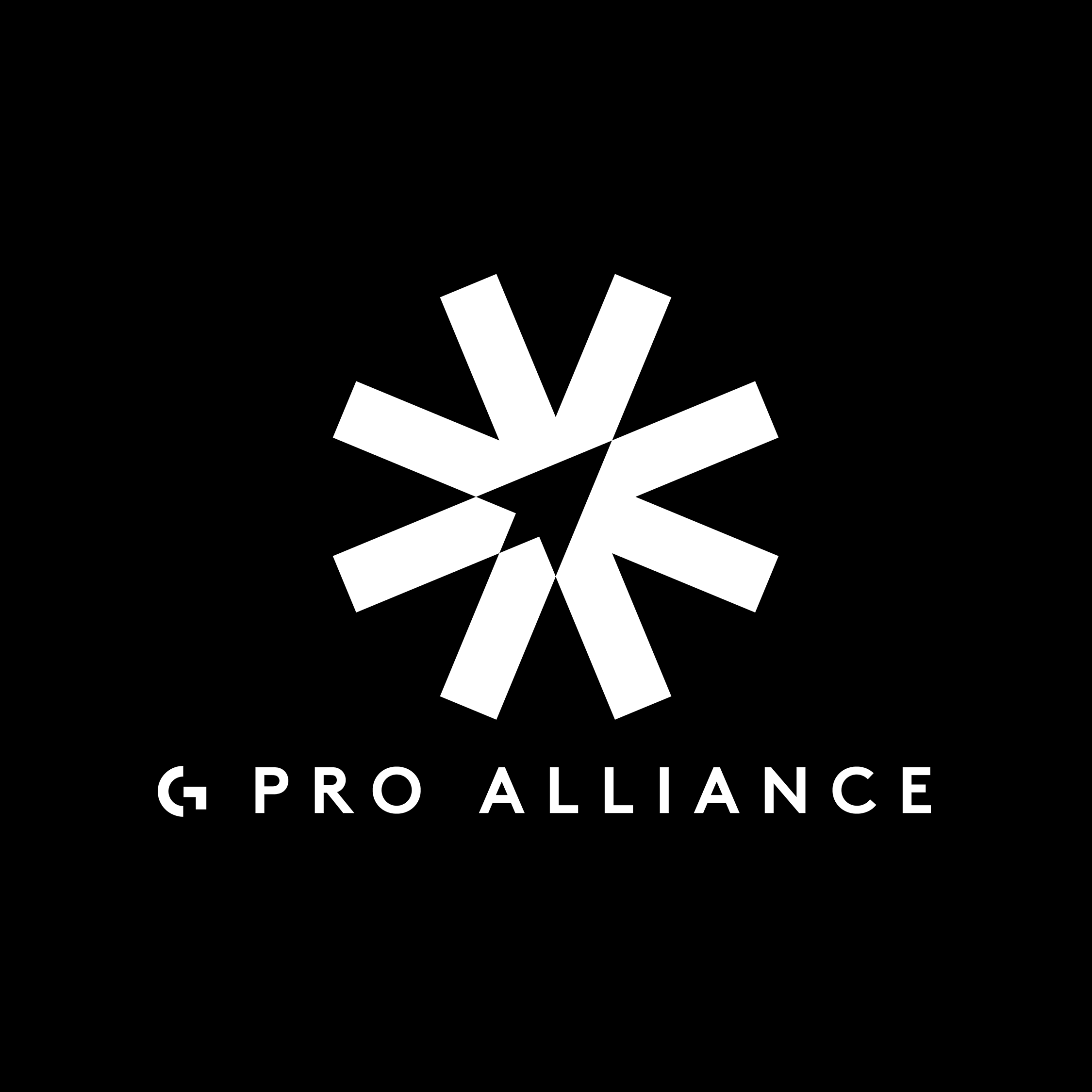
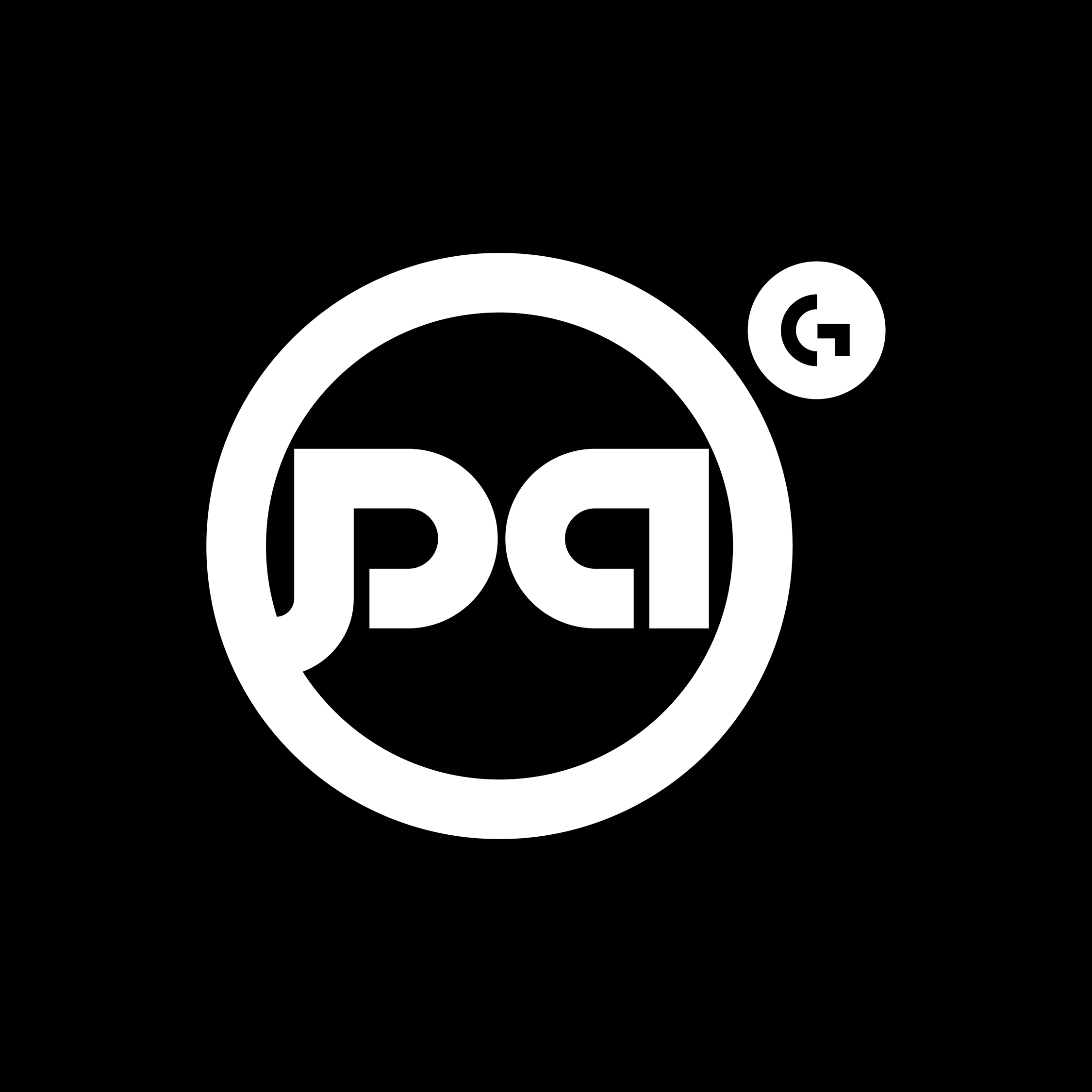
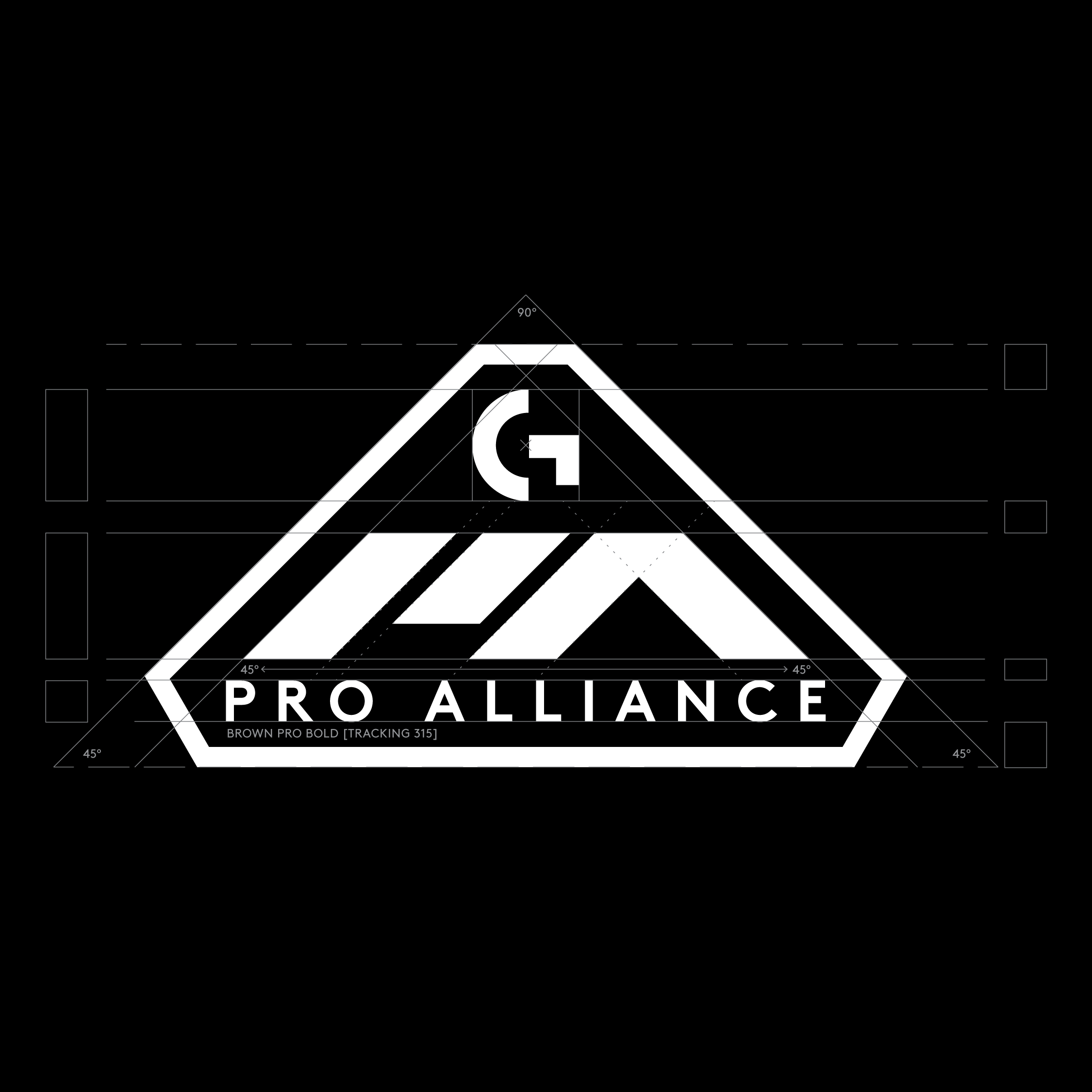
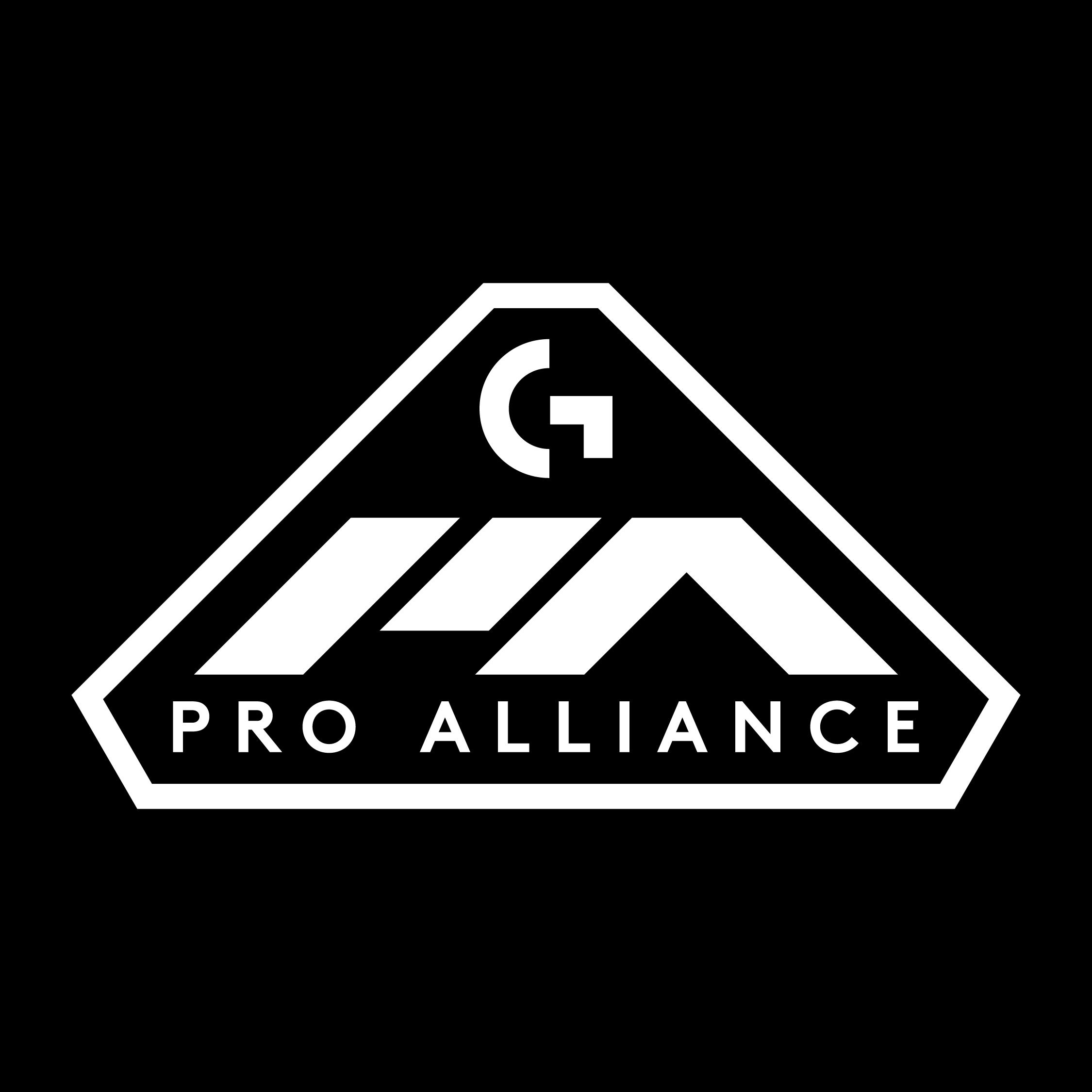
This particular mark was made feel monolithic, like a mountain, a bunker, a ziggurat with “G” rising up like a sun. It was refined into the main shield logo, a badge version, and a simpler type-only small version.
I used the repeating angle and rhombus shapes from the main mark to extend the brand into the five pillar icons.